Advertising Sales Prediction

Project Overview
This data analysis project examines unemployment trends across Indian states during 2020, with a focus on understanding the impact of COVID-19 lockdown measures. Using Python's data science stack, I analyzed monthly unemployment rates, employment figures, and labor participation rates across different regions of India, revealing significant variations and the pandemic's effect on employment.
Technical Specifications
| Component | Technology |
|---|---|
| Programming Language | Python |
| Data Analysis | Pandas, NumPy |
| Data Visualization | Matplotlib, Seaborn, Plotly |
| Data Source | Unemployment_Rate_upto_11_2020.csv |
| Key Metrics | Unemployment Rate, Employed, Labor Participation |
Key Features
Regional Analysis
- Grouped statistics by region and state
- Comparative analysis of unemployment rates
- Labor participation rate trends
Geographic Visualization
- Animated geo-scatter plots
- Interactive regional comparisons
- Lockdown impact visualization
Temporal Analysis
- Monthly employment trends
- Pre/post lockdown comparisons
- Seasonal pattern identification
Statistical Insights
- Correlation matrix analysis
- Box plot distributions
- Comparative regional statistics
Data Visualizations
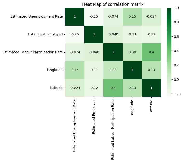
Correlation Heatmap
This heatmap shows the correlation between unemployment rate, employment figures, labor participation rate, and geographic coordinates. The strongest relationships help identify which factors most influence unemployment trends.
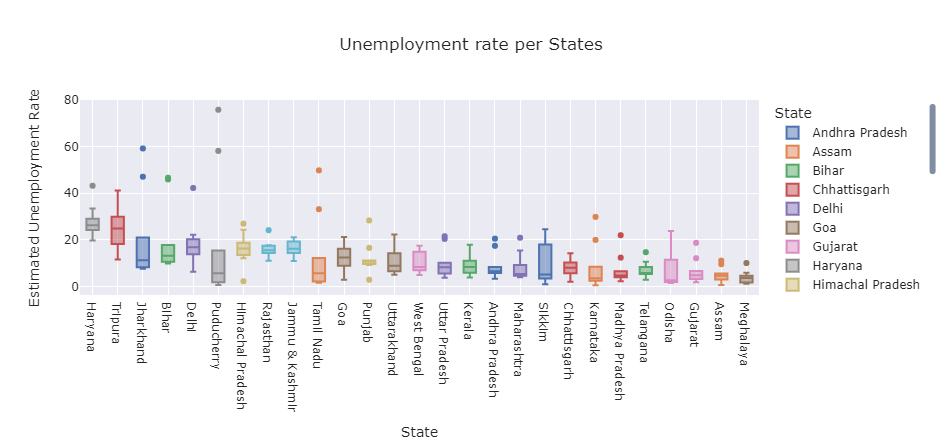
State-wise Unemployment Distribution
Boxplot showing the distribution of unemployment rates across different Indian states. Highlights states with particularly high or low unemployment rates and shows variation within each state's data.
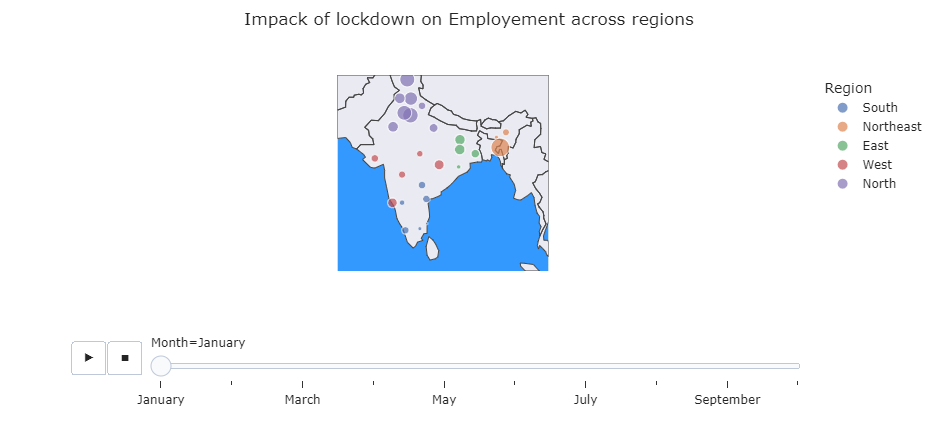
Geographic Unemployment Visualization
Animated map showing how unemployment rates changed month-by-month across different regions of India, particularly highlighting the impact of COVID-19 lockdown measures.
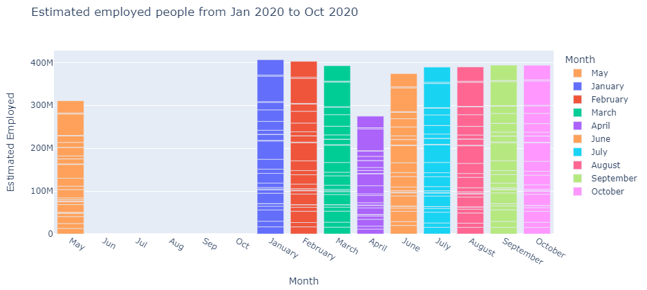
Monthly Employment Trends
Bar chart tracking estimated employed citizens each month from January to October 2020, showing the dramatic impact of lockdown measures on employment.
Technical Implementation
Data Preparation
# Import libraries
import pandas as pd
import numpy as np
import calendar
import datetime as dt
import matplotlib.pyplot as plt
import seaborn as sns
import plotly.express as px

# Load and prepare data
df = pd.read_csv("Unemployment_Rate_upto_11_2020.csv")
df.head()

# Clean and transform data
df = df.rename(columns={'Region': 'State', ' Date': 'Date',
                       ' Estimated Employed': 'Estimated Employed',
                       ' Estimated Unemployment Rate (%)': 'Estimated Unemployment Rate',
                       ' Estimated Labour Participation Rate (%)': 'Estimated Labour Participation Rate',
                       'Region.1': 'Region'})

# Convert to proper data types
df['Date'] = pd.to_datetime(df['Date'], dayfirst=True)
df['Frequency'] = df['Frequency'].astype('category')
df['Region'] = df['Region'].astype('category')

# Extract month for temporal analysis
df['Month'] = df['Date'].dt.strftime('%B')
Geographic Visualization
# Impact of lockdown visualization
fig = px.scatter_geo(df, 'longitude', 'latitude', color="Region",
hover_name="State", size="Estimated Unemployment Rate",
animation_frame="Month", scope='asia',
template='seaborn',
title='Impact of lockdown on Employment across regions')

# Adjust map boundaries for India focus
fig.update_geos(lataxis_range=[5,35], lonaxis_range=[65, 100],
oceancolor="#3399FF", showocean=True)
Results & Findings
Regional Analysis
- Highest Unemployment: Northern regions showed the highest average unemployment rates
- Most Stable: Southern regions maintained relatively stable employment figures
- Urban Impact: Metropolitan areas experienced sharper employment drops
Lockdown Impact
- April 2020: Sharpest increase in unemployment following nationwide lockdown
- Recovery: Gradual improvement from June onward
- Sectoral Differences: Varied impact across different economic sectors
Challenges & Solutions
| Challenge | Solution |
|---|---|
| Data normalization | Standardized column names and formats |
| Geographic visualization | Used Plotly with custom India-focused boundaries |
| Temporal analysis | Created month extraction for consistent time series |
| Outlier detection | Implemented boxplot visualization for distribution analysis |
Policy Implications
- Regional Focus: Targeted employment programs for high-unemployment regions
- Sectoral Support: Industry-specific recovery initiatives
- Skill Development: Enhanced training programs in affected areas
- Monitoring: Improved real-time employment tracking systems
Future Enhancements
- Integration with more recent employment data
- District-level granularity for localized analysis
- Economic sector breakdown of unemployment
- Interactive dashboard for policy makers